Overview
ARt is a spatial painting tool: people paint, mix colors, and lay down textured pathways in 3D space using a headset and a tracked handheld palette, with a companion mobile "window" that lets bystanders watch and join in. My charge was an interaction-design problem more than a graphics one. How do you make a brand-new way of working feel learnable in the two minutes someone spends at a trade-show booth?
The core challenge: people are conditioned by flat screens, so moving and selecting along the depth axis is genuinely hard for first-timers. I designed the controls around building muscle memory fast and protecting people from mistakes, rather than exposing every capability at once.
The ask
How might we showcase a new actuator paradigm in an augmented reality application?
My role & impact
I joined a project already aimed at fashion design. The bet was that the ring-format actuator, small enough to sit on a finger, could simulate cloth and swatch textures. But a few quick interviews with fashion designers told a different story: none of them would take a simulated swatch seriously. So I proposed a major pivot. Rather than imitate fabric, we would build a painting experience grounded in passive haptics, where the finger rests against a real physical surface while augmented-reality paint blobs sit offset from it. That reframing let the actuator prove its value twice over: not only in pure augmented reality, where the finger touches nothing, but also against real surfaces, where the ring augments and reshapes the sensation of what the hand already feels.
From there I owned the experience end to end. I proposed and designed the interaction flows for both the headset and mobile experiences, recommended the hardware for the palette (Sensel Morph), and led sound and tactile-feedback design. I partnered with research for iterative testing, another designer and engineers on tracking and feasibility, and directed the external visual-design contractors who produced the holographic art, reviewing their work against the interaction model so the visuals reinforced how the tool was meant to be used.
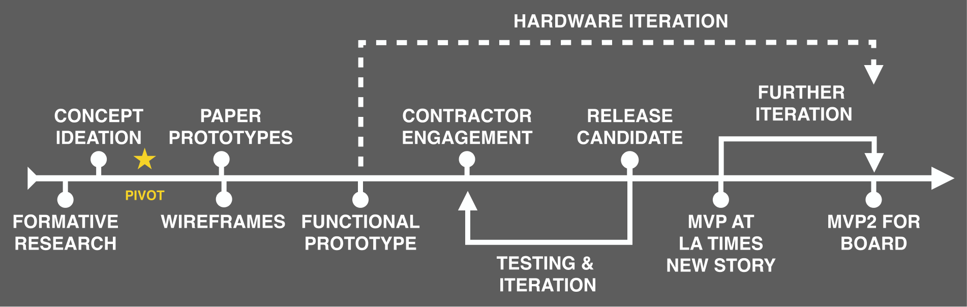
Process & key decisions
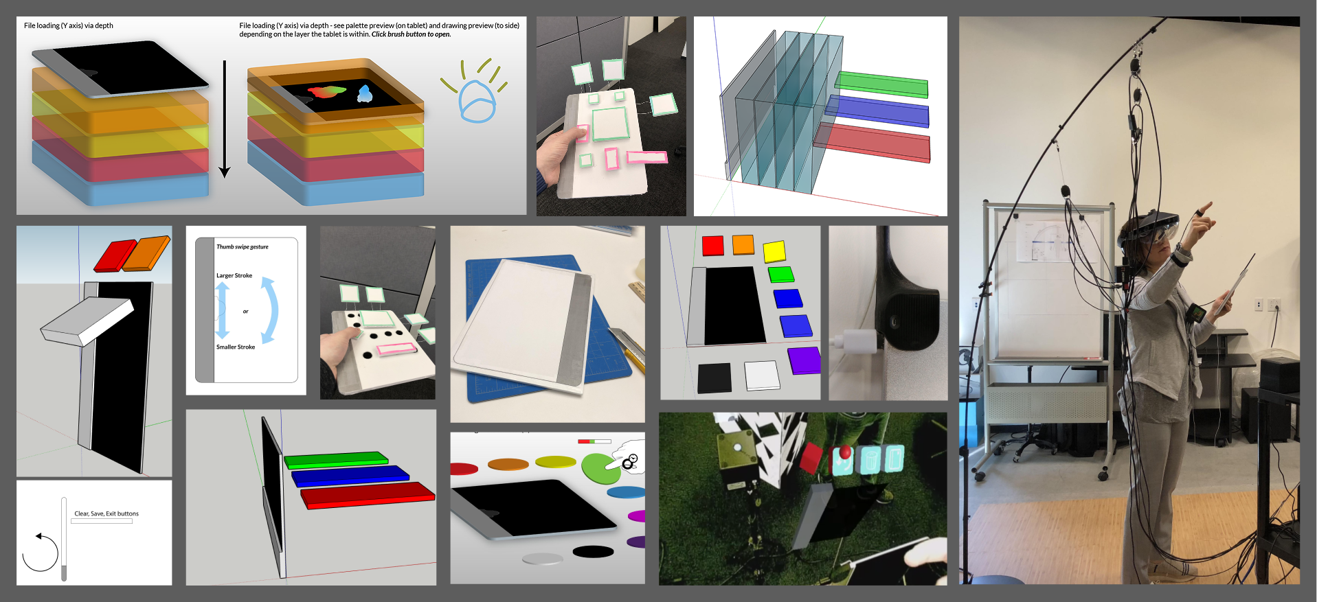
Two menu systems came out of iteration, each solving a different problem:
- The quick-action menu (undo, clear palette, clear scene) is deliberately two-handed. These actions are destructive, so I required a confirming second hand to prevent accidental data loss: friction added on purpose.
- The "layer cake" is a one-handed menu for saving and loading. It tracks with the palette until you hold to select, then freezes in place. Paired with tactile feedback, it let users build muscle memory: repeatable, eyes-up gestures instead of hunting through menus.
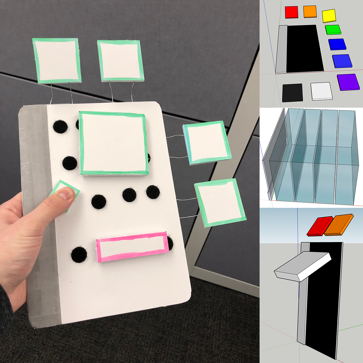
I prototyped the palette's physical shape and size extensively to find placement that worked for both the holographic content and the user's hand.
Insight & evolution
Sessions confirmed the depth problem: older people struggle to move along the forward axis (surprisingly, the younger a person was who tested the experience, the more likely they would be to not require as much guidance). My next proposal was to extend the hover system into a depth affordance (animated strands that visually pull the user toward an interaction), plus hand-occlusion rendering so real and virtual hands read correctly.
Outcome
The proof of concept won over Immersion's board of directors, and the response at the LA Times Festival of Books was overwhelmingly positive. The deeper payoff was the learning: supporting both a mobile app view and the Metavision HMD meant managing multiple coordinate systems in Unity at once, which taught me a lot about spatial interfaces and how hard they are to get right.